This page is dedicated to solving UX/UI flaws I encounter while using popular mobile or web applications.
App #1 - Netflix
Netflix is a streaming service that offers a wide variety of award-winning TV shows, movies, anime, documentaries, and more on thousands of internet-connected devices.
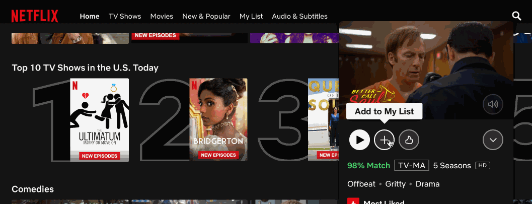
UX FLAW
Hover animation should not cover other functional options. In this case, hovering over the "Like" button cover the "Add to My List". Every time I try to add a movie/tv show to my list I mistakenly hover over the like option and misclick "not for me option" as that option hovers on top of the "Add to My List" button.
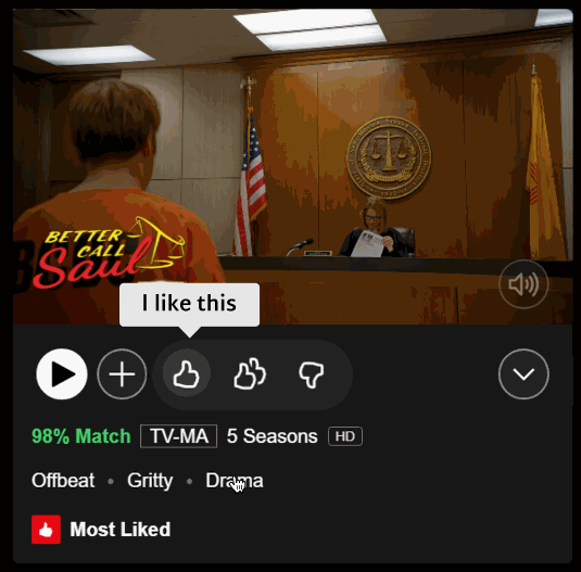
Solution
The solution is pretty straightforward. There is a lot of space in front of the like button; therefore the "like" option should expand toward the negative space on the right side. I designed the following solution using Figma.